


Let’s face it. Complex apps are not fun to use, yet we are reluctant to trust the capabilities of the one that looks simple. We, while showcasing FieldAssist, often encounter the expression “That looks so simple”. It keeps us wondering why managers are generally so focused on the number of options available on home screen whereas the focus should be on actually evaluating how easy it is to choose an option and get things done. Why to seek a slider to fine tune every little detail when on-field no one likes to play with 10 different knobs to make a simple transaction?
We at FieldAssist always believe that “Simplicity is a virtue”. Hence,we put every effort to keep our app simple without compromising on its robustness.
FieldAssist is much easier to use, is cost effective and much more user friendly. Let’s dig a little deeper into our design philosophy.
Keep it Simple: Most people try to visualise mobile app as traditional IT solution. They want the app loaded with features that will eventually bog the users down. They look for the perfect app, with every conceivable feature included. But in practice, too many options become confusing to start with and frustrating to use. We understand that anybody can make a complicated app, thus we always walk an extra mile to make everything as simple as it could be. A simple app may take more resources to develop but it will save time and effort for our users; this is especially the case with sales force automation software.
Don’t build the features; Solve the problem: Our app is not a mindless bunch of features, rather it is a hand crafted solution to everyday problems. The purpose is to get things done more quickly and more effectively. We strongly advocate only adding the appropriate things at the right place instead of just bloating it with the features.
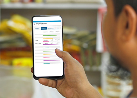
Don’t make them think: At FieldAssist we know that decision making is an exhausting exercise, that’s why we keep a linear flow in the app. Most of the screens are equipped with couple of relevant options (or just one, wherever possible) to choose from. We know that most of the time that is the button that people are going to click anyway. Thus, why not make it the only button on the screen while hiding the less frequently used features in contextual menus? We also use a lot of colors and icons that keeps decision making a lot less overwhelming for our users.
Effortless learning curve: More is less. It can’t be truer than in scenario of mobile applications. As mobile applications are accessed on smaller screen, it is the most important to keep it simple and uncluttered. User friendly apps better user acceptance than the complex apps which are more difficult to learn and to use.
Always keep improving: FieldAssist, by no means, is a perfect sfa app. While we keep learning and improving from our experiences, your inputs play an important role in suggesting a better solution.
Table of Contents
ToggleAbout Post Author
Rashmi Kapse
Rashmi is a Content Specialist at FieldAssist. After spending 11 years in the Executive Search business she decided to change tracks and follow her passion for writing. For the past 8 years, she has been writing on Sales Tech, HR Tech, FMCG, Consumer Goods, F&B and Health & Wellness.