


I have been in many meetings with both emerging companies as well as big, established brands where ‘data’ is a constant challenge. For big companies especially, the frustration hits a high pitch. “We have data coming out our noses, but we are still not able to get the kind of insights we want!”
Sometimes, even after companies invest in a business intelligence tool, it can become a bigger headache if they don’t know how to use it well.
DATA DATA EVERYWHERE, NOT AN INSIGHT IN SIGHT!
That’s what happened to a Rs 400 crore Indian fruit-beverages company. When I met their sales leadership last week, I realized that their specific problem wasn’t ‘data’. It was actually ‘too much data!”
“We are drowning in reams of excel sheets. It takes us time to visualize that data and identify patterns and red flags, which then delays taking timely decisions in the field!”
To solve that problem, they deployed a pretty decent BI tool but the UI/UX was too complex for their MIS guy, and he needed constant assistance from the tech partner! The tool offered a standard dashboard but the mid-managers wanted to track a different set of metrics.
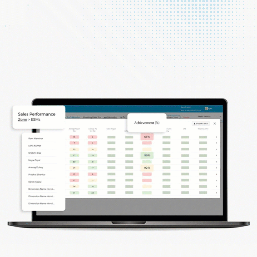
For e.g. the RSMs wanted 12 specific metrics on their dashboard that they could track in real-time. But they couldn’t customize the BI tool’s dashboard. So every time the senior leaders wanted data, the MIS guy had to download the standard report (which carried data on 22 KPIs) and then physically mark out the 12 KPIs that they wanted to see. Long story short, the MIS guy was ready to resign within 2 months!
This is the kind of frustration that sales leaders and mid-managers face day in and day out. It’s not because the data is not being captured, but the problem is that :
A. data points are not converted into consumable insights to enable strategic business decisions
B. exceptions don’t get highlighted in time.
ON-THE-GO GRAPHS AND CHARTS TO MAKE SENSE OF YOUR DATA
This is especially true for big companies. A lot of data does not automatically mean a lot of usable intelligence. Unfortunately, business intelligence tools are an expensive investment and usually require an additional resource like an analyst or an MIS manager to make sense of the data.
So when I spoke to them about how Quick Viz could address their problems, their first question was, “Can I see only the data that I want to see?”
“Absolutely! Quick Viz has a very easy interface.
All you have to do is select the KPIs you want to see on the dashboard, and that’s it.
You can have your own customized dashboard within minutes. No need for a separate resource to manage the reams of data coming in from the field. Use precise, real-time charts and graphs to take precise real-time business decisions. “
Then came his next question, “How does your system help me get actionable insights?
“The strongest feature of Quick Viz is that it helps you make a smooth transition from intuition to evidence-based decision-making via powerful analytics. Drilled-down Exception highlighting helps you see the complete story, not just data points, by going right down to the root of a problem.
For example, you might notice an exception in sales in your North region. When you drill it down further, you may see that the specific area in the North showing poor performance is the state of UP. Within UP, you may discover that sales are low in some districts because Total Call numbers are low. Drilling down further, you may realize that it is because your team is understaffed in those areas. Our dashboard helps you go to the ground level to find out the root cause of a problem.”
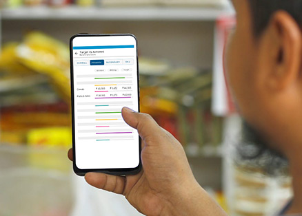
VISUALIZED DATA PATTERNS THAT MAKE DECISION-MAKING SIMPLE
The same fruit beverages company has today moved away from a reactive approach to data to taking proactive measures by using insights from Quick Viz. Their mid-managers are taking real-time decisions anytime, anywhere in the field with easy-to-read charts that are available right on the mobile. The brand is delivering personalised promotions and optimising its marketing spend. For every territory, they are able to offer targeted product assortments to bring the products to the right consumer. In the field, they are taking real-time decisions to open up operational bottlenecks and improve their team’s efficiency.
In my opinion, what any FMCG company needs to achieve actionable insights is a BI tool that can a) crunch the data up and present it in readable, easily consumable form, and b) an easy-to-use front end that gives a delightful user experience.
FieldAssist hits that sweet spot with Quick Viz which gives the data that you want in easy-to-read graphs and charts. Do your mid-managers want real-time information on how the new products are doing but don’t want the headache of looking at excel sheets? They can have that data right on their dashboard. Do you want to see how your team is performing on the top 3 KPIs but not have to constantly download reports to do that? See it right there on your dashboard.
Watch Now: Pathfinders | Stories of Great Brands
So if you too are looking to wow your customers with incisive data-backed GTM strategies, contact us.